Remedy Packaging Redesign
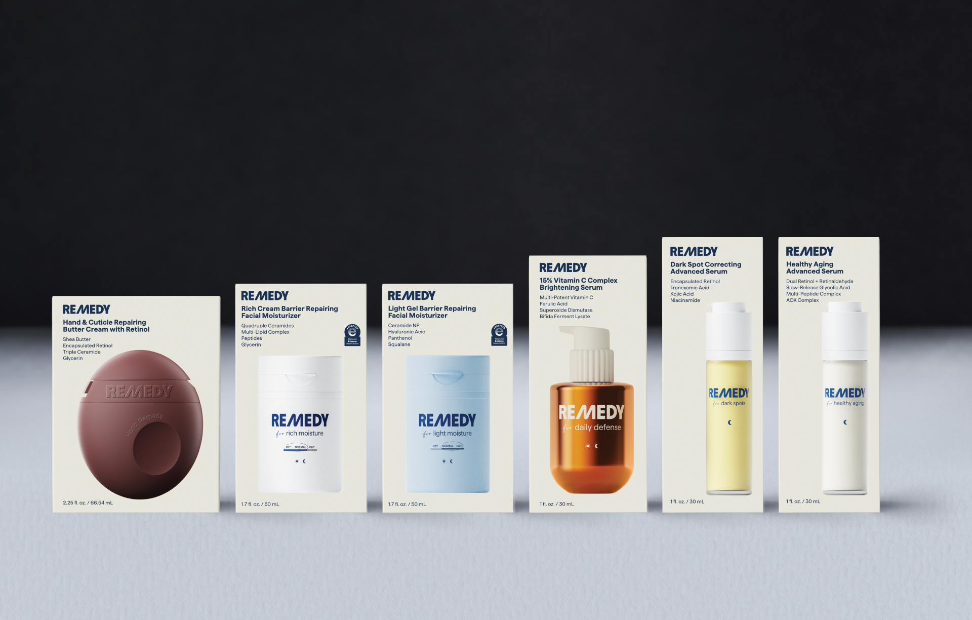
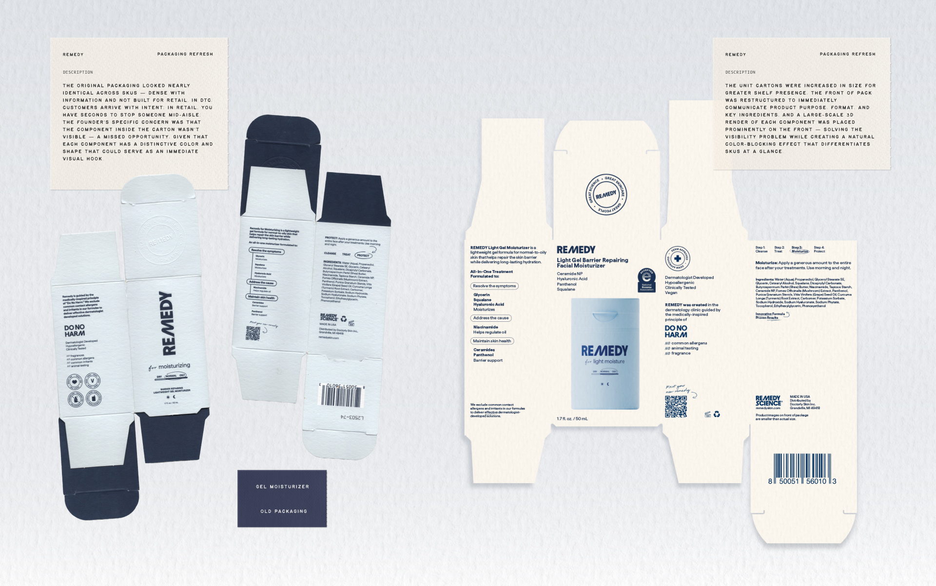
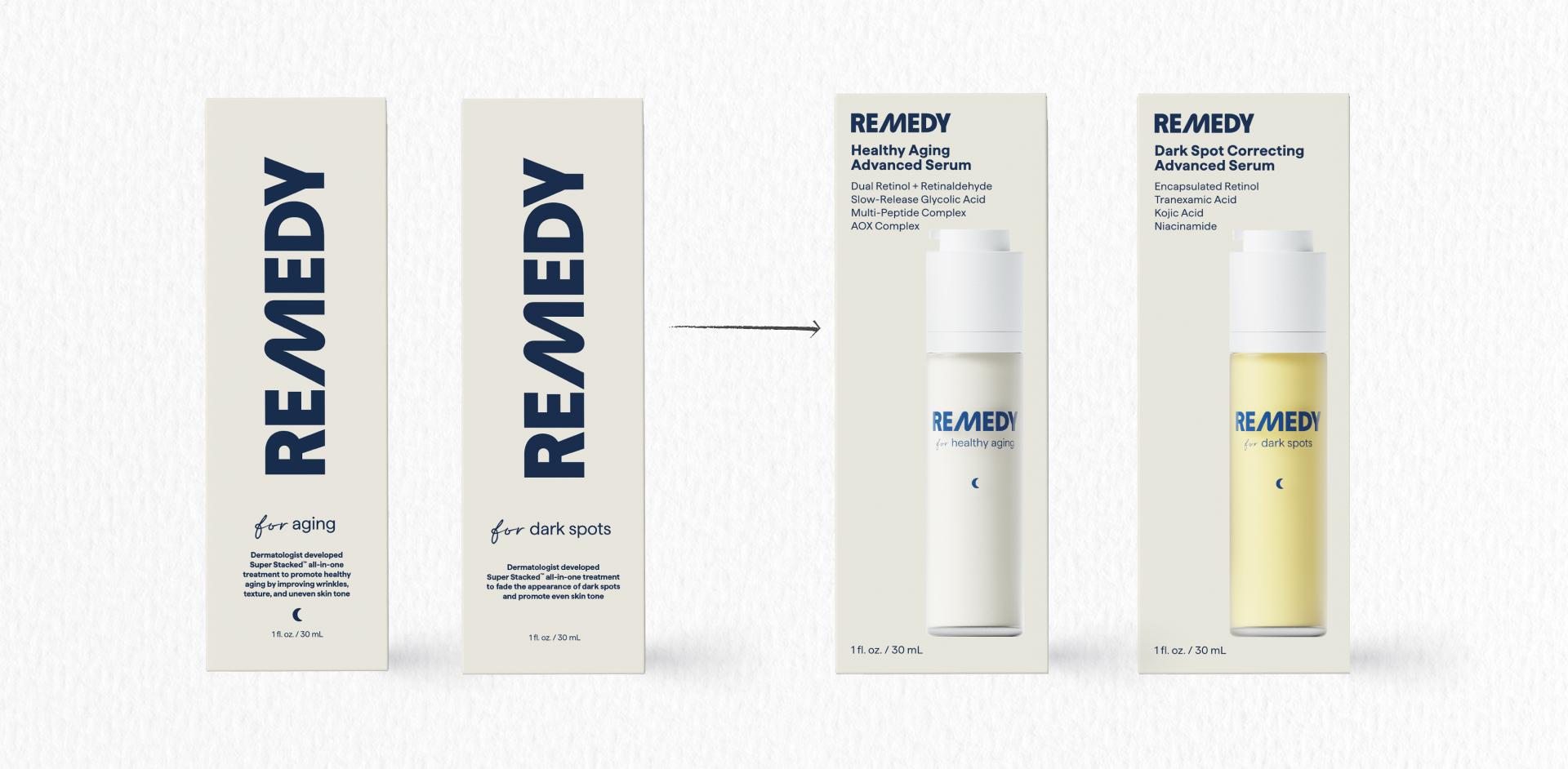
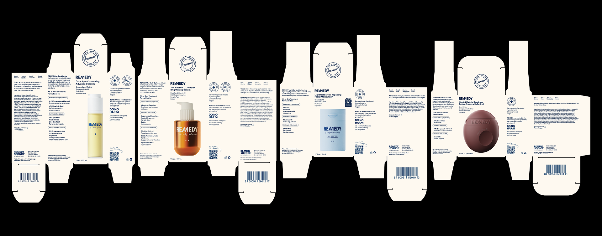
Remedy was transitioning from DTC/Amazon to Target retail and needed packaging that could compete on shelf — the original design looked too similar across SKUs and didn't communicate the product inside.
The Key Decisions
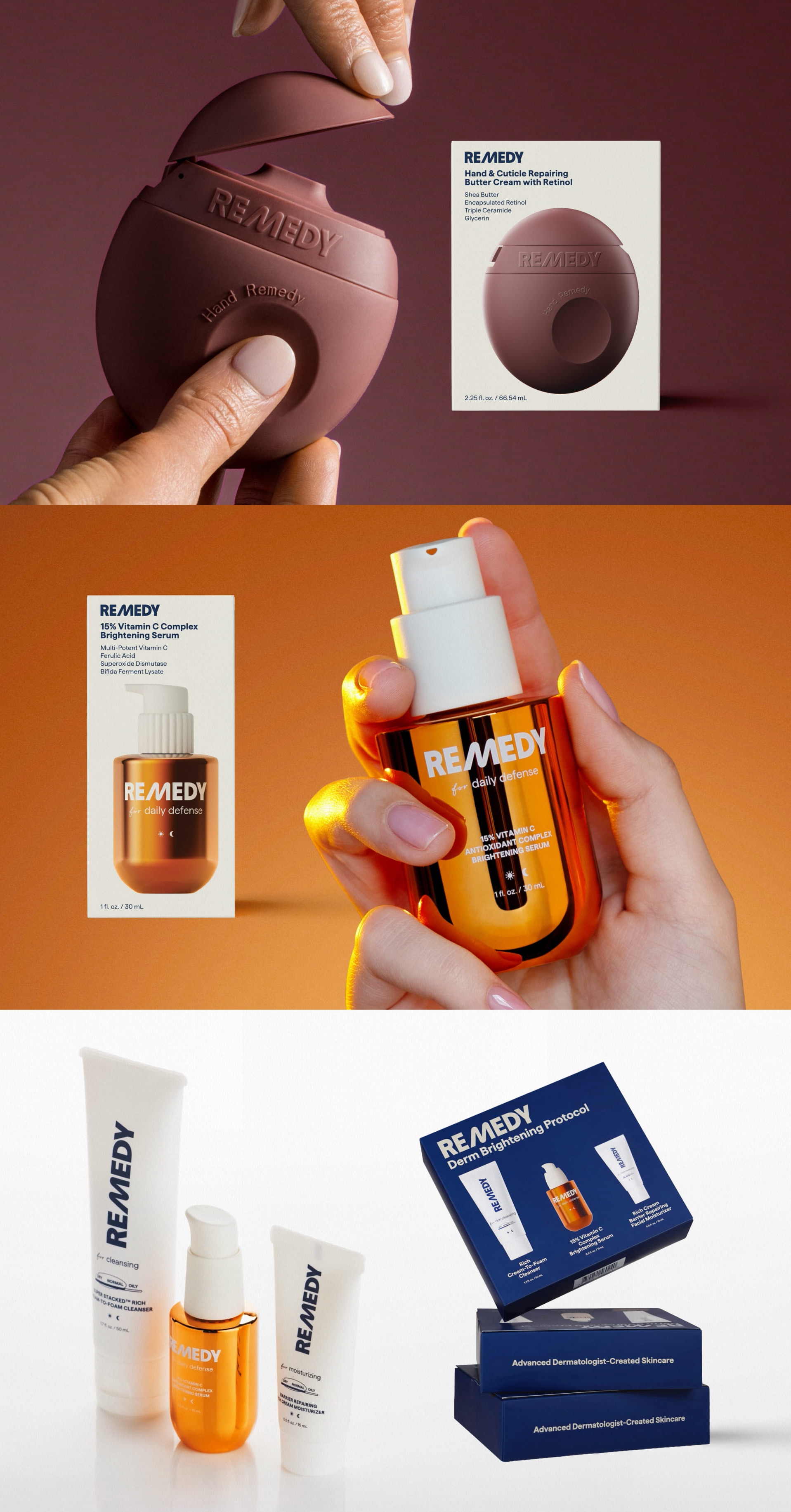
- Scaled up 3D component renders to anchor the front of pack, which solved both the visibility problem and created an organic color-blocking effect without compromising the premium positioning
- Built a rigorous 3D pipeline — separate artists for modeling and lighting, with detailed briefs and reference packages for each, plus post-render color correction to ensure print accuracy across all SKUs
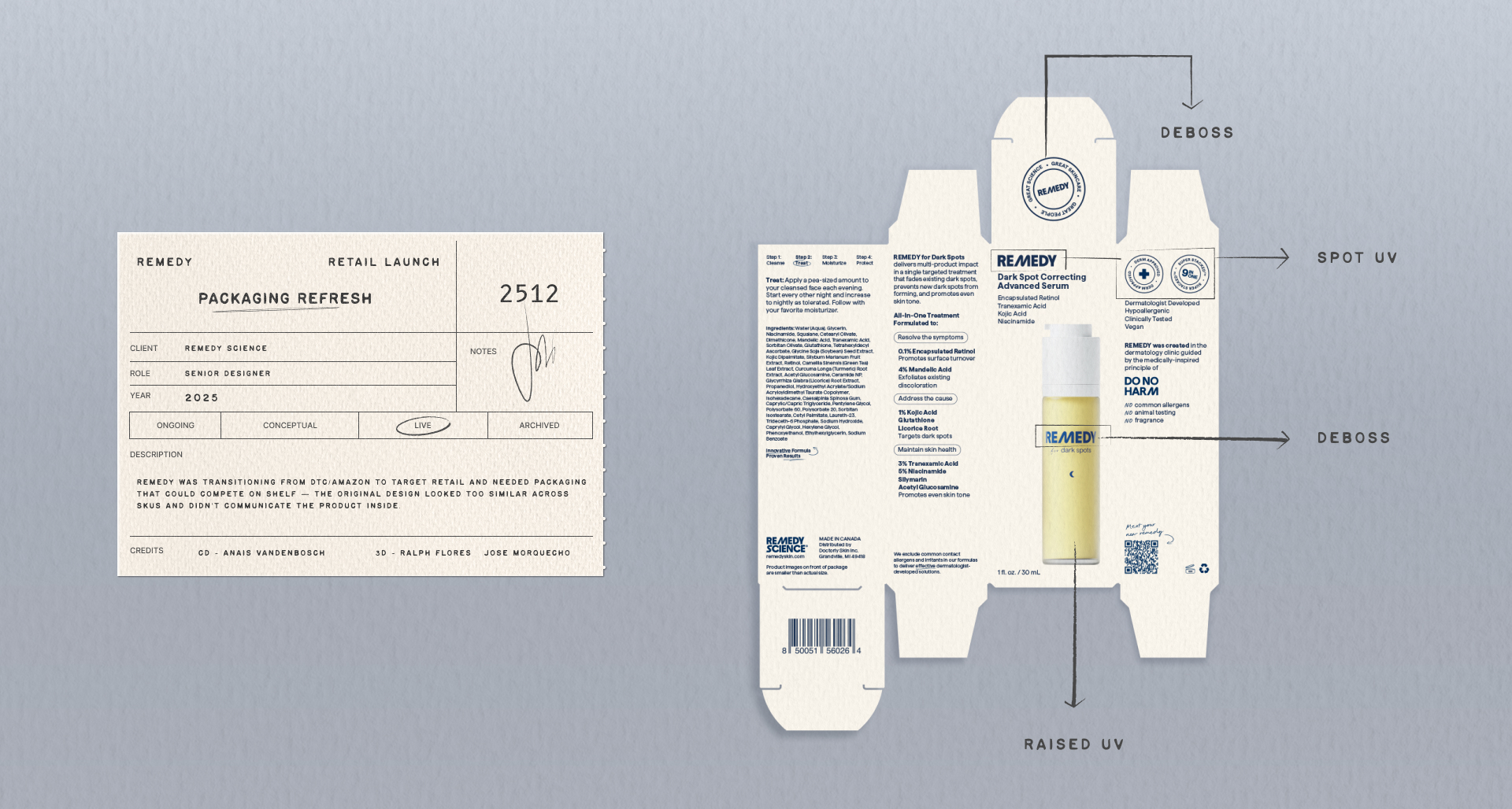
- Because the components themselves have tactile, frosted, and matte finishes, the carton surface was specified in soft matte laminate to echo that materiality and create a cohesive material story across the object as a whole
- Spot UV and debossing were layered on top of the soft matte surface to create deliberate contrast — making metallic renders shine through and adding a tactile experience that elevates the packaging beyond category conventions
- Maintained consistent visual hierarchy and typography by simplifying the label deco on the component renders, ensuring front-of-pack communication was always clear and uncluttered
No items found.
Next Project →
Bon Appétit